On screen, a wall is never just a wall. The pattern behind an actor tells you the year, the money, and the mood before a word is spoken, and great set designers know it.
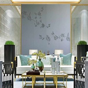

Walls as silent storytellers
Production designers use wallcovering the way a novelist uses a first sentence. A cramped kitchen papered in faded florals says one thing about a character; a penthouse in glossy black and gold says another. The audience reads it instantly and often without noticing, which is exactly the point.
Because film has to communicate fast, set walls tend to be bolder and more specific than the walls in most homes. A dramatic scenic, a period damask, or a saturated geometric does the work of a paragraph of dialogue, anchoring the scene in a place, a class, and a decade.
Period accuracy and the power of the print
Getting the era right lives largely on the walls. A 1970s scene leans on earth tones, big organic repeats, and metallic foils; a Victorian parlor needs dense, dark botanicals and rich damasks; a 1950s home wants cheerful mid-scale geometrics. Set decorators research these patterns closely because a wrong wall pulls a knowledgeable viewer straight out of the story.
The same logic works at home. If you love a film's era, its wallcovering is the fastest way to borrow the feeling. A single wall of a well-chosen period pattern does more to summon a decade than a room full of furniture will.
Drama that survives the camera
Film sets favor high-impact walls because cameras and lighting flatten subtlety. Large-scale patterns, deep jewel grounds, metallics that catch a lamp, and strong contrast all hold their power under bright set lights and read clearly on screen. Delicate, low-contrast patterns tend to vanish.
You can steal that instinct for spaces that want a cinematic charge: a dining room, a home bar, a dressing room. Choose scale up rather than down, lean into contrast, and pick a finish with some sheen. The goal is a wall that feels like a set, composed, deliberate, and a little larger than life.
Quick checklist before you order
- Pick the eraLet the decade you love guide the palette and pattern; period accuracy lives mostly on the walls.
- Scale upLarge, high-contrast patterns keep their drama under bright light, the way set walls do on camera.
- Chase sheenMetallic and lacquer-look grounds catch light and give a scene that cinematic charge.
- Commit one roomGive a dining room, bar, or dressing room the full statement rather than diluting it across the house.
- Mind the moodDecide the feeling you want a visitor to read in three seconds, then choose the pattern that says it.
Frequently asked
How do set designers choose wallcovering for a period film?
They research the exact decade's palettes, scales, and motifs, because a wrong pattern breaks the illusion for viewers who know the era; the wall does more period work than the furniture.
Why do movie walls always look so bold?
Camera lighting flattens subtle pattern, so sets use large-scale, high-contrast, often metallic coverings that keep their impact on screen.
Can I get a cinematic look in a normal-size room?
Yes. Choose one room, scale the pattern up, lean into contrast and a little sheen, and let that wall carry the whole dramatic effect.
Read more
- The Overlook's walls: how Kubrick used pattern to make a hotel feel wrongIn The Shining, the Overlook's surfaces carry real weight. A look at how Stanley Kubrick and designer Roy Walker built dread into a gilded interior, and how later horror interiors work along similar lines.
- The Tenenbaum zebras: the true story of one wallcovering that stole a movieThe black-and-white zebra hallway in The Royal Tenenbaums is a real, documented design with a history older than the film. How Wes Anderson turned a decades-old pattern into a character.
- How a set decorator actually gets a wall treatment onto a filmBehind the on-screen room is a union craft of clearances, quantities, continuity, and impossible deadlines. A plain-language look at who chooses the walls and how.
- Shooting at Versailles: how period productions get the walls rightMarie Antoinette filmed inside the palace itself; Mad Men aged its walls across a decade; Bridgerton papered a fantasy. What each approach reveals about surface accuracy on screen.
- Barbie Land was almost entirely surface — and it workedThe 2023 Barbie built its world out of saturated color and pattern rather than architecture. What its production design shows about letting a surface carry a whole room.
- Wallpaper's Silent Storytelling: When Texture Speaks Volumes in Film